2/4/2021
PITTSBURGH – Researchers at the University of Pittsburgh School of Pharmacy and West Health Policy Center found that in many parts of the country, Black people are less likely than White people to live near a pharmacy, clinic, hospital or health center that can administer COVID-19 vaccines.
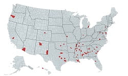 In 69 counties, home to 26 million people, Black residents are significantly more likely than Whites to live more than a mile from the closest vaccination facility. These counties are especially concentrated in Georgia, Missouri, Louisiana, Virginia, Texas and Alabama. And a third of them are located in urban areas, including Atlanta, Dallas-Fort Worth, Houston, Detroit, New Orleans and New York City.
Troublingly, nearly three-quarters of the counties with these racial disparities in vaccine access also have a high rate of new COVID-19 infections—which tend to be more fatal and severe among Black Americans than Whites—with a daily average of more than 50 new cases per 100,000 during November 2020 to January 2021.
Racial disparities in vaccine access already are apparent. Earlier this week, the Centers for Disease Control and Prevention reported that of the 13 million Americans who were vaccinated against COVID-19 in the first month of the rollout, only 5% were Black.
“It’s important to adopt a data-driven approach to make sure we get vaccine distribution that’s equitable,” said Inmaculada Hernandez, Pharm.D., Ph.D., assistant professor at the Pitt School of Pharmacy and senior author of the study. “Not all counties have the same limitations in existing infrastructure, and that variability is what public health policy should be focused on. We won’t be able to vaccinate everyone if we adopt a one-size-fits-all strategy statewide.”
“Pharmacies should be easy to access, but in some places there’s low capacity or low density, and the flood gates are opening,” said Lucas Berenbrok, Pharm.D., assistant professor at the Pitt School of Pharmacy and first author of the study. “When barriers are present, like driving times, there needs to be a plan to reach those people. We can’t forget about them.”
This new analysis comes as an update to the University of Pittsburgh School of Pharmacy and West Health Policy Center’s open-access VaxMap, which was created in December to measure vaccination facility density and driving distance of all residents to locations where COVID-19 vaccines will be administered. In the earlier iteration, there was an emphasis on measuring barriers to vaccine access for people over the age of 65.
As with the previous maps, the researchers used geographic information system (GIS) software to map nearly 70,000 potential COVID-19 vaccine administration facilities. In addition to the maps showing average facility density and driving distance at the county level, the researchers also created an interactive map showing the location of each individual facility, so anyone can check their nearby options.
“As President Biden and his team work to administer 100 million vaccines in 100 days, it is critical that state and local agencies take these geographic and demographic challenges into account to provide additional resources to areas that are underserved,” said Tim Lash, president of West Health Policy Center. “If we are to reach herd immunity and emerge on the other side of this pandemic, we must ensure age, race and zip code do not define access to a vaccine and future health outcomes.”
“Our maps identified areas of the country where temporary vaccination sites in locations like parking lots, stadiums and fair grounds will be needed to ensure all Americans have access to a vaccine,” said Sean Dickson, director of health policy, West Health Policy Center. “We hope that this analysis will equip the new administration and state and county governments with information about where greater support is needed.”
PHOTO INFO: (click image for high-res version)
PHOTO INFO: (click image for high-res version)
CREDIT: Inmaculada Hernandez
CAPTION: VaxMap 2.0: Counties where Black residents are significantly more likely than White residents to live >1 mile from a COVID-19 vaccination facility.

